Introduction
Workspace provides a configurable, general purpose 2D visualisation facility in the form of the CreateChart operation. This operation allows users to visualise many different data types in varying and interesting ways. Built on top of the NVD3 and D3 javascript libraries, the CreateChart operation allows users to completely customise the results of the charts generated, and even design their own custom visualisations. By the end of this tutorial, you will:
- Understand how to create a chart using the CreateChart operation
- Understand the various types of charts available out-of-the-box
- Understand how to customise your chart by modifying the generator script and stylesheet
Contents
Creating a chart
Creating a Chart using Workspace is quite straightforward, requiring the use of a CreateChart operation. The CreateChart operation is a highly configurable operation that can take a user-defined set of inputs and create a Chart. A Chart in workspace is comprised of the following components:
- A number of input DataObjects, each of which can be referenced when generating the chart visualisation. For example, an input may be one or more ObejctDictionaries, each representing a group of data points on a scatter plot.
- A script, written in Javascript, that tells Workspace how to use the inputs to generate the visualisation. This script can use any functionality in the NVD3 or D3 javascript libraries in order to generate a chart.
- A stylesheet, written in CSS (v2), that describes any custom styles or behaviours to apply to elements in the visualisation.
As you may have guessed, Charts are rendered in HTML with an embedded SVG element. This not only means that generated charts can be easily scaled to different resolutions, but that they can be interacted with, either via the embedded ChartWidget available within Workspace, or by exporting the Chart as a webpage which can be loaded into any web browser.
In this example, we are going to create a simple scatter plot.
Sourcing the data
In this particular case, we are going to obtain our data from a CSV file.
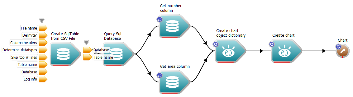
- From the Operation Catalogue, drag a CreateSqlTableFromCsvFile operation onto the canvas
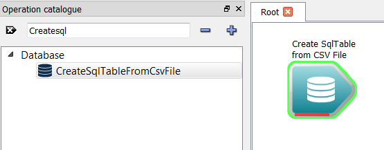
The CreateSqlTableFromCsvFile operation
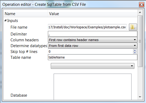
- Select the operation by clicking on it, and in the Operation Editor, select the file "plotsample.csv" in the Examples directory. Leave all of the other inputs with their default values.
Selecting the input CSV data
- Drag a QuerySqlDatabase operation onto the canvas
- Connect the Database output of the CreateSqlTableFromCsvFile operation to the Database input of the QuerySqlDatabase operation
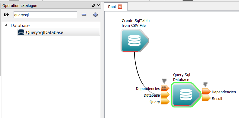
Connection the QuerySqlDatabase operation
- Select the QuerySqlDatabase operation, and in the Operation Editor, enter the following into the "Query" input:
select * from tableName This will select all of the available records from our database. Note that tableName is the default name of the table created by the CreateSqlTableFromCsvFile operation. If you wish to change this, modify the appropriate input of this operation. For more information on querying databases, please see the Basic SQL Database tutorial on databases.
- From the Operation Catalogue, drag-and-drop two GetSqlResultSetColumn operations onto the canvas, in both cases, selecting DataSeries as the datatype.
- Connect the Result output of the QuerySqlDataset operation to the Result set input of each of the GetSqlResultSetColumn operations.
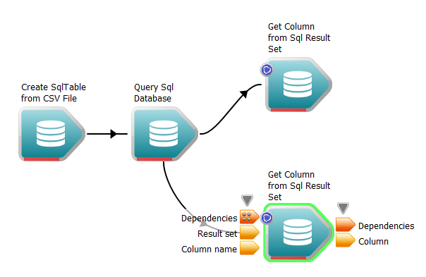
Getting columns from the result set
- Select the first/top GetSqlResultSetColumn operation and:
- Set its "Column name" input to number
- Using its Propery page set its label to "Get number column"
- Select the second/lower GetSqlResultSetColumn operation and:
- Set its "Column name" input to area
- Using its Propery page set its label to "Get area column"
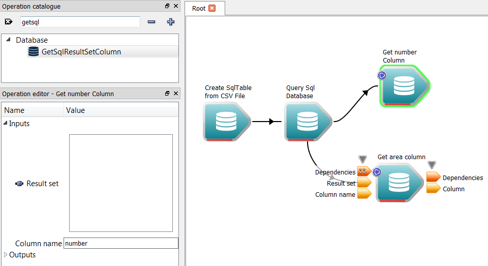
The workflow so far
The CreateChart operation
- From the OperationCatalogue, drag-and-drop a CreateChart operation onto the canvas. If we have a look at this operation, we will see that by default, it has two inputs: – Script: This input contains Javascript that is executed in order to generate the chart. The user can customise this to create any visualisation they wish. This will be talked about more in the section Customising the chart. – Style: This input contains CSS (v2) rules, that are applied at the time the chart is rendered. This will be talked about further in the section Customising the chart.
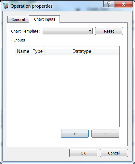
- Right click on the newly created operation, and select Properties from the context menu
- In the properties menu, select the "Chart inputs" tab.
The Chart inputs tab of the CreateChart properties dialog
- In the "Chart Template" combo box, select the "Scatter plot" type, and click the Apply template button. This will reset the inputs listed in the inputs table to the default inputs used to generate this plot type. If, however, you require additional data to be fed into your plot, you can add additional inputs, or change the datatypes of existing ones. We will delve into this further in the section Customising the chart.
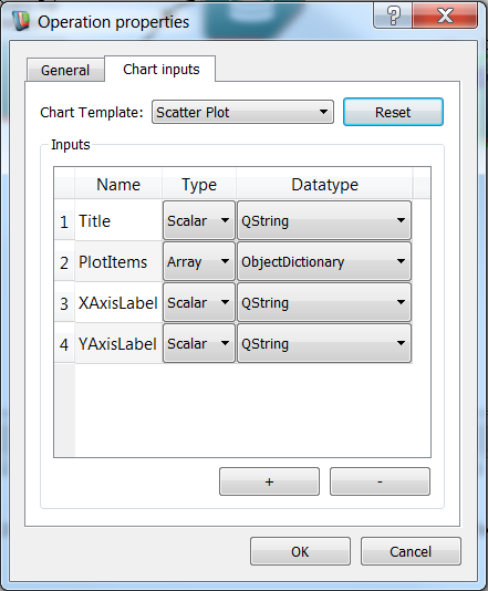
The Chart inputs tab after selecting the Scatter Plot template
- Click the "OK" button on the Operation properties dialog.
Grouping data using Object Dictionaries
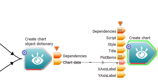
If we look at the CreateChart operation again, we will see that it now has additional inputs, each matching the description of those that were listed in the "Chart Inputs" tab of the CreateChart properties dialog. Of these new inputs, the most important is the PlotItems array input, which we can see is an array of of type ObjectDictionary. Each ObjectDictionary connected to this input will be displayed as a set of points on our Scatter Plot. To create an Object Dictionary:
- Drag-and-drop a CreateChartObjectDictionary operation onto the canvas.
- Connect the Column output of our "Get number column" and "Get area column" operations to the XValues and YValues inputs of the CreateChartObjectDictionary operation.
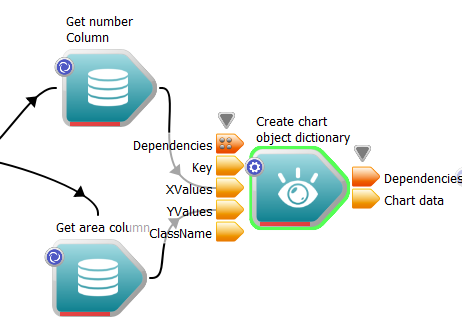
The number and area columns being added to an object dictionary
- Connect the Chart data output of our CreateChartObjectDictionary operation to the PlotItems input of the CreateChart operation.
Connecting the object dictionary to the CreateChart operation
- Note
- Just as the CreateChart operation can be customised to have multiple inputs of differing types, so can the CreateChartObjectDictionary operation. We will delve into this more in the Customising the chart section.
Displaying the chart
First of all, we need to complete our workflow by adding a Workspace output:
- Right-click on the Chart output of the CreateChart operation and select "Create Workspace output".
The completed workflow
Now that we've done that, we can display the chart.
- Right-click on the Chart output of the CreateChart operation, and select the "Display with ChartWidget operation"
- Execute the workflow
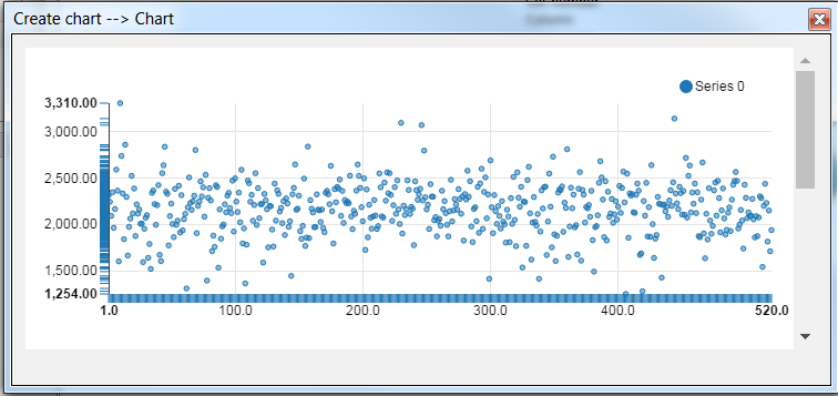
The final scatter plot
Congratulations! You've successfully created your first Workspace chart. Read on to discover how to customise your chart, how to use different chart types as templates, and how to export charts in different formats. Note that you can interact with the chart by hovering your mouse over the various components.
Customising the chart
In the previous section, we read some data from a CSV file and displayed it on Chart using the Scatter Plot as our base template. In this section, we are going to slightly customise our chart to scale each point according to a property in the dataset.
Editing the chart generation script
The first thing we need to do is modify our script so that it uses point size data. To do this:
- Right click on the Script input of the CreateChart operation, and select "Display with JSEditWidget"
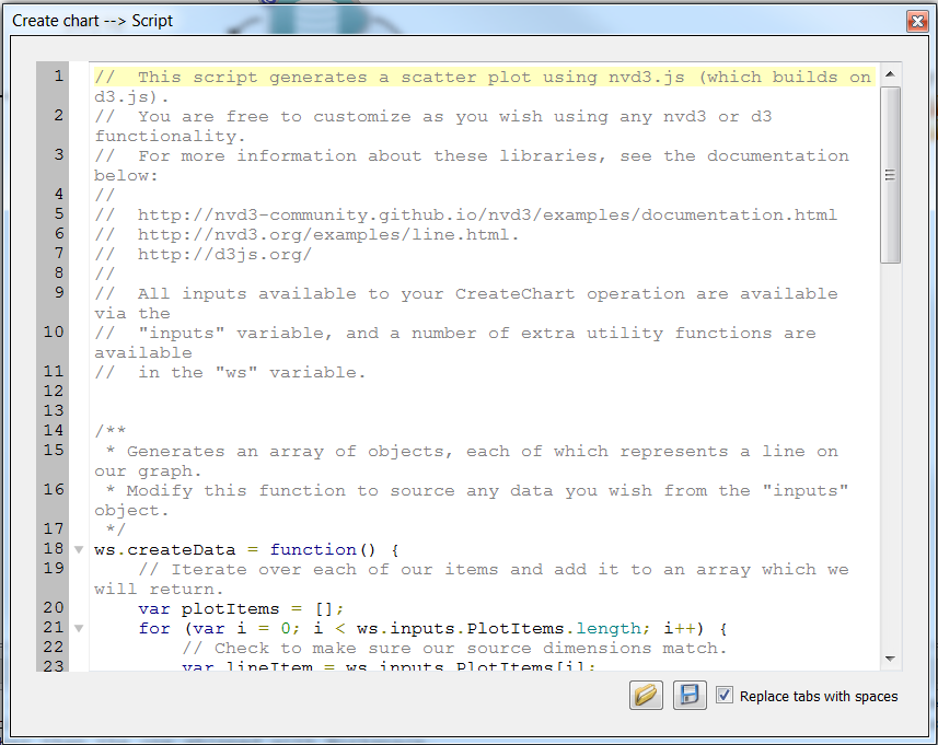
The JSEdit widget
- In the JSEdit widget, you will see the script that is used to render our chart. There are a number of key elements in this script:
- createdata: a function used to generate an array of objects for NVD3's chart generator to use (this is actually used by D3 under the hood). createData is invoked by the generator function provided to ws.addChart.
- ws.addChart: This function is passed a generator function, which is itself executed when NVD3 attempts to render the chart. All code used to set up the chart should be inside this function.
- ws.inputs, which is the object containing all of the custom inputs passed to the CreateChart operation. In our case, this will contain Title, LineItems, XAxisLabel and YAxisLabel.
- In the JSEdit widget in the createData function at around line 36, we can see that a line of code has been commented out:
series.push({
shape: 'circle'
});
unsigned char x
Definition: wsgloctreeshaderimplementation.cpp:81
unsigned char y
Definition: wsgloctreeshaderimplementation.cpp:82
Incorporating extra data into our chart item
Now that our script has been updated to expect a Sizes value for each item, we need to make sure our workflow reflects this. Much like the CreateChart operation, our CreateChartObjectDictionary operation can be customised to accept user-defined inputs. In our case, we want to modify the operation to accept a third DataSeries called Sizes. To do this:
- Right click on the CreateChartObjectDictionary operation, select "Properties" and navigate to the "Object dictionary members" tab of the dialog.
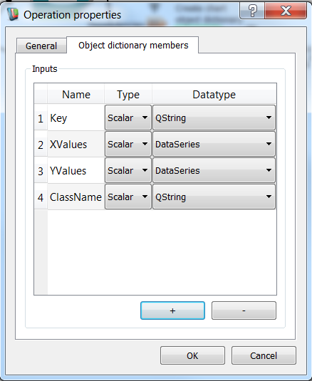
Editing our CreateChartObjectDictionary inputs
- Click on the add button to add a new input.
- Double click the "Name" field of the newly added row to edit its name, and set it to "Sizes"
- Change the data type of the new row to DataSeries
- Click "OK"
You will now see on the workflow that our CreateChartObjectDictionary operation has a new input called Sizes, of type DataSeries. Now all we need to do is provide a data series to the operation. To keep things simple, we will re-use one of our existing data series. To do this:
- Expand the outputs of the "Get area column" operation
- Connect the Column output of this operation to the Sizes input of our CreateChartObjectDictionary operation
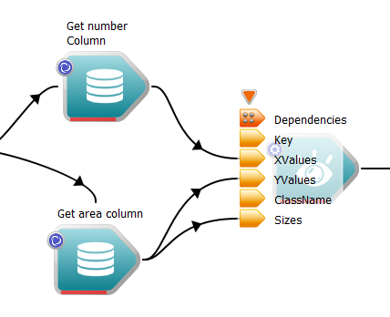
Connecting the Sizes DataSeries
- Execute the workflow
You will now see that each item in the scatter plot is sized according to its area:
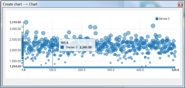
The chart after connecting the Sizes DataSeries
Now we have seen how to create a chart based on one of the standard types, and modify it to incorporate our own data. Note that ObjectGroups, ObjectArrays, QVectors and basic types like QStrings, ints and doubles can all be passed into both the CreateChart operation, as well as the CreateChartObjectDictionary operation.
- Note
- Charts can be heavily customised. Users are free to completely replace all of the code inside the script variable with their own, using any of the functionality of d3.js or nvd3.js.
Exporting charts
So far, we've create a chart and customized it to accept a third dimension of data. Now we are going to look at the various ways of exporting chart data so that it can be used either downstream in the workflow, or by a third-party application external to Workspace. There are four different ways that Charts can be exported:
- As an Scalable Vector Graphics (SVG) file on disk, using the WriteChartToSvgFile operation.
- As an SVG string, containing the XML representation of the SVG, using the ChartToSvgString operation.
- As a QImage, which can itself be written to disk or used downstream in the workflow, using the ChartToImage operation.
- As a static web page on disk, which can be opened in any web browser, using the WriteChartToWebPage operation. All of the CSS and Javascript dependencies of the page will also be exported to a sub-directory.
Each of these operations provide various options, such as the desired width and height of the SVG, and the render timeout, in the case that the chart is heavily customised and does not notify Workspace that it has completed rendering.
Summary
This concludes the tutorial on visualizing data with charts. You should now know how to:
- Create, customize and export charts
A sample workflow for this tutorial can be found here.