Introduction
In the previous tutorial, we created a custom datatype to represent our Rectangle information. Since we used the ObjectGroup base-class, Workspace was able to give us:
- The ability to edit the data type with ComposeGroup
- The ability to extract values from it with DecomposeGroup
- The ability to edit the values through the operation editor (it creates widgets for each member)
For some data types, this may not be sufficient to display or edit the data type. For example, more complex data types can be visualised differently, such as images, scenes or tree structures. In this tutorial, we will create a widget for editing the properties of our Rectangle data type.
By the end of the tutorial we will:
- Understand how to use the built-in code wizard to create a custom widget
- Understand how to use Qt Designer to design the widget's user interface
- Understand the code behind a custom widget, and how it is used by Workspace
Contents
Sample files used and modified in this tutorial
Using the "Create Workspace Widget" code wizard
In the previous tutorial, we used the Workspace code wizard to generate the code for our Rectangle data type. In this tutorial, we're going to use the Create Workspace Widget wizard to add a skeleton widget to our simple plugin. To start the wizard:
- Navigate to the
Development menu and select Create workspace widget... Create datatype widget
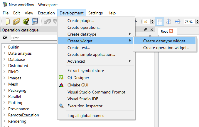
Finding the code wizard
- A window will be displayed that looks something like this:
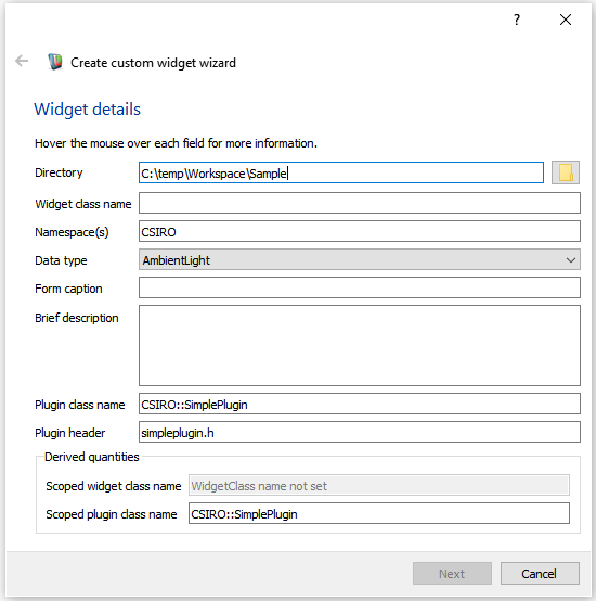
The create workspace widget wizard
We can use this code wizard to generate the skeleton code required for a custom widget. Let's start by filling out the fields on the form:
- Directory: The directory in which our widget source files will be created. Point this to the same location that your plugin source is located.
- Widget class name: The C++ class name for our new widget. We will call ours "RectangleWidget"
- Namespace(s): The namespace used for the class. We will use
CSIRO as we did in the previous tutorial.
- Data type: The data type that this widget will be associated with. Whenever a user tries to create a display widget from an input/output of this type, they will see an entry in the context menu for the new widget. We will set ours to
Rectangle.
- Form caption: The text to be displayed in the title bar of the widget when it is displayed stand-alone. we will use the text
Rectangle Widget
- Brief description: This will appear in the code as a short comment describing what the widget does. we will enter the text,
"A widget for visualising the properties of a rectangle."
- Plugin class name: The fully-scoped name of the plugin class that will contain this widget. We're going to use the plugin we created previously,
CSIRO::SimplePlugin.
- Plugin header: The header that contains the definition of the containing Workspace plugin. Again, we refer to the file we generated in the previous tutorial:
simpleplugin.h
- Note
- At any time you can check the purpose of these fields by hovering over them with the mouse and reading the tooltips (as shown above).
Our form will now look something like this:
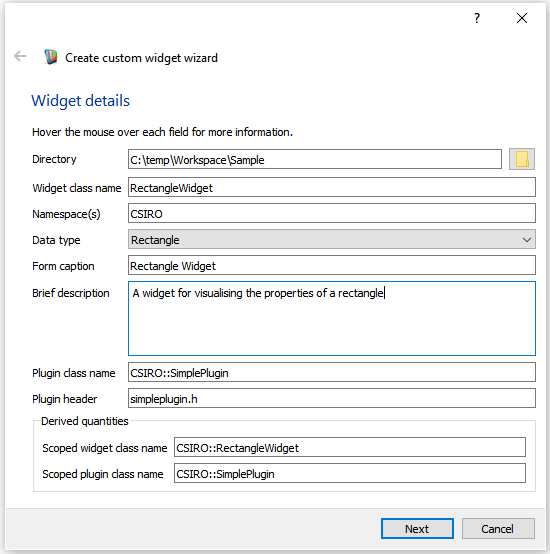
Our values entered into the wizard
If we now look at the bottom of the plugin wizard, we will see some derived values. Workspace is showing us the name of the scoped class name of the new widget, as well as the scoped class name of the plugin that it is going to add it to. Next:
- Click the Next or Continue button
As we did with the data type wizard, we now get to select a copyright notice.
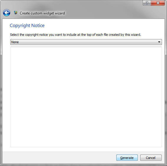
Select none for this tutorial
Workspace will now generate the code for our new widget and place it in the directory that we selected earlier (the same directory into which we generated our plugin). If you navigate to this directory, you'll see that it has the following contents:

The contents of the plugin directory after generating the operation
For more details about the code generated, see Writing a custom widget - looking at the code or click on one of the links to individual files below.
- rectanglewidget.h This file is the C++ header for the new widget. It contains a class that extends the QWidget base-class.
- rectanglewidget.cpp This file contains the C++ source for the new widget. It contains the definition of the class declared in rectanglewidget.h
- rectanglewidget.ui This file contains the XML description of the widget's user interface. It can be interactively edited in the Qt Designer utility. When the plugin is compiled, UI controls defined in this file are compiled by Qt into a special ui_rectanglewidget.h file, which contains the actual C++ code defining the basic user interface.
- rectanglewidgetconnector.h Contains the declaration of a class extending QWidgetConnector. This class provides the special mechanisms to feed data from an input / output into a widget, and to update an input / output's data using the widget.
- rectanglewidgetconnector.cpp Contains the definition of the class defined in rectanglewidgetconnector.h
- rectanglewidgetfactory.h Contains the declaration of a class that knows how to create our new widget, as well as our new widget connector. This class will be registered with our plugin so that Workspace can create new widgets on-demand.
- rectanglewidgetfactory.cpp Contains the definition of the class defined in rectanglewidgetfactory.h
Rebuilding
Now that we've added our new files to the plugin, we will need to take the steps we did in the previous tutorial to compile our tutorial:
- Launch CMakeGui from the Workspace's Development menu
- Click Configure
- Click Generate
- Following the steps from the Writing a Simple Workspace Plugin tutorial, recompile your plugin for your target platform
Modifying the user interface
Next up, we will need to use Qt Designer to modify the user interface description file, rectanglewidget.ui. To do this:
- From the Workspace's Development menu, launch Qt Designer
- When the application launches, select
File > Open and in the provided dialog, browse to the location of your rectanglewidget.ui and click the Open button.
- You should see an empty form something like this.

The default Custom Widget in Qt Designer
Now we're going to add some child widgets to our form which we will use to display the properties of our rectangle.
- From the WidgetBox on the left of the screen, drag-and-drop a Label on to the form.
- Double-click the Label and change its text to
Width
- Drag another Label onto the form and change its text to
Height
- Drag a Double Spin Box onto the form.
- Click on the Double Spin Box and in the Property Editor on the right of the screen, change its objectName property to
width
- Drag another Double Spin Box onto the form and modify its objectName property to height
- Right-click on some empty space and select Lay Out in a Grid
- Click the Save button.
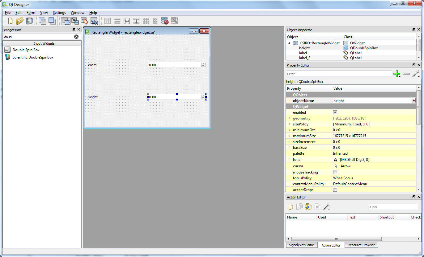
The updated Custom Widget in Qt Designer
- Note
- The QDoubleSpinBox control has a default maximum of 99.00. If you want to change the number of decimal places or the maximum value, you can do so via the Property Editor panel.
Now that you've done that, recompile the plugin. This will update the Qt generated UI code so that we can reference it from within our rectanglewidget.cpp file.
The next step is to modify our updateWidget and updateData functions to control the user interface. Below is the code we will add into the rectanglewidget.cpp file:
bool RectangleWidgetImpl::updateWidget(const CSIRO::Rectangle& data)
{
ui_->width->setValue(data.getWidth());
ui_->height->setValue(data.getHeight());
return true;
}
What we're doing here is extracting the values from our Rectangle and updating the text displayed in the widgets. Similarly, our updateData method moves data from the widget's controls into the Rectangle data.
bool RectangleWidgetImpl::updateData(CSIRO::Rectangle& data)
{
data.setWidth(ui_->width->value());
data.setHeight(ui_->height->value());
return true;
}
The last thing we need to do is connect our spin boxes' valueChanged signal to our widgets widgetUpdated signal. This will ensure that whenever our spin boxes change, our data is updated as soon as possible. We do this by adding a few lines to the constructor:
RectangleWidget::RectangleWidget(QWidget* parent) :
QWidget(parent),
pImpl_(std::make_unique<RectangleWidgetImpl>(*this))
{
bool connected = true;
connected = connect(pImpl_->ui_->width, static_cast<void (QDoubleSpinBox::*)(double)>(&QDoubleSpinBox::valueChanged), this, &RectangleWidget::widgetUpdated);
connected = connect(pImpl_->ui_->height, static_cast<void (QDoubleSpinBox::*)(double)>(&QDoubleSpinBox::valueChanged), this, &RectangleWidget::widgetUpdated);
}
#define WS_VERIFY_RUNTIME(cond)
Definition: errorchecks.h:228
Note that the static cast is necessary in this case to distinguish between the two types of valueChanged signals that a QDoubleSpinBox can emit (double or QString).
Now that we've made those changes, we can now recompile and load up Workspace.
Using our new widget
To use the widget, we can do the following:
- From the Operation Catalogue, drag-and-drop a CalculateRectangleArea operation on to the canvas.
- Click on the operation to see its properties in the Operation Editor or right click on the Rectangle input and select "Display with RectangleWidget" from the context menu.
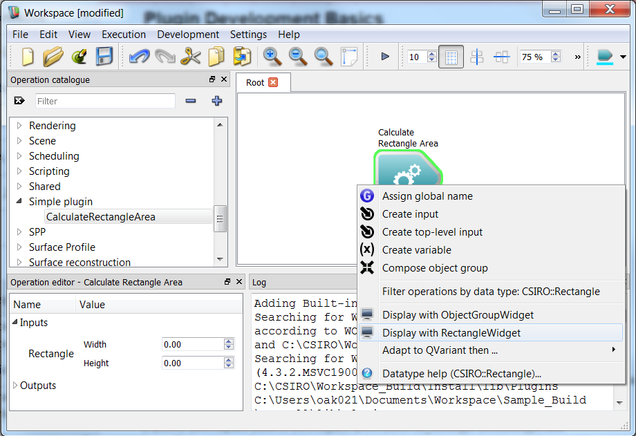
Adding the Custom Widget to an input
- Right click on the Area output and select "Display with QLineEdit" from the context menu.
- Right click on the Dependencies output and add a Workspace output
- Execute the workflow
- You can now change the values in the display widget and it will instantly update the operation.

Executing a workflow with a custom widget
Summary
This tutorial has introduced you to the essential elements of adding a new custom widget to your Workspace plugin. The main points to remember are the following:
- The Create workspace Widget wizard will generate skeleton code for a Widget, WidgetFactory and WidgetConnector
- The Widget has two key methods which we need to implement: updateWidget (for updating the widget's controls) and updateData (for updating the data in the workflow using the user's entered input). These are the only methods which should be used to read or write data.
- Qt Designer can be used to modify the generated user interface file (.ui) to add any child controls that you desire.
- The WidgetFactory is registered with Workspace via your plugin's setup() function and allows Workspace to create instances of your new Widget on demand. You will most likely never need to change this class.
- The WidgetConnector allows Workspace to safely communicate with your widget via its updateData and updateWidget methods. It is the only class in Workspace that knows both the type of your widget and the type of the data it is displaying.
Next steps
The following tutorials are suggested as next steps: