Hydrodynamics – GBR4
Surface maps
Plan views of elevation, surface temperature and surface salinity snapshots and animations are accessed via the links below. The ‘still’ link provides the most recent snapshot of the archive, whereas the animation provides several days of the most recent output appended to the archive.
Output from OceanMAPS is provided as well as GBR4 for reference.
Surface elevation and surface currents – animation / still
Temperature (surface) – animation / still
Salinity (surface) – animation / still
Cross-shelf Sections
Cross-sectional views of temperature and salinity (snapshots and animations) from the coast to deep ocean through Heron Island and Palm Passage are accessed via the links below.
Heron Island transect – animation / still
Palm Passage transect – animation / still
Exposure maps
Exposure maps provide an indication of the cumulative impacts of heat and freshwater. We provide four measures of temperature exposure using the eReefs model products:
- The NOAA Degree Heating Week (DHW) algorithm (https://coralreefwatch.noaa.gov/satellite/methodology/methodology.php#dhw). This product uses a climatological maximum summer temperature (often referred to as the Maximum of the Monthly Mean (MMM) SST climatology) at each location in the GBR, and computes the difference between this value and the modelled temperature (i.e. the HotSpot). The MMM is computed using the CARS climatology (Ridgeway et al, 2002). The NOAA DHW product integrates HotSpots greater than 1oC over a 12 week period to provide an indication of the intensity and duration of thermal stress, with units of oC-weeks. A value of 4 oC-weeks has been shown to be indicative of significant coral bleaching. NOAA Hotspot GBR4 Temperature Exposure – animation / still
- Temperature exposure. This exposure metric integrates the difference between the model temperature and daily climatological temperature as provided by CARS, only when this difference is positive (i.e. when model temperature is greater than climatology). If the model temperature is less than daily climatology for 7 consecutive days, then the exposure is reset to zero. This metric also is expressed in units of oC-weeks.GBR4 Temperature Exposure – animation / still
- ReefTemp exposure. This measure of thermal stress integrates the difference between the model temperature and daily climatological temperature as provided by CARS (when model temperature is greater than climatology) for the summer of a given year (1 Dec to 1 Mar). This metric also is expressed in units of oC-weeks.ReefTemp Temperature – animation / still
- Salinity exposure (psu days): this is computed as (28 – S) x days that salinity is below 28. Exposure is reset to zero if salinity spends more than 1 day above 28.Salinity – animation / still
River plumes:
The footprint of individual rivers can be calculated using conservative tracers. Two techniques are:
- Dye the river mouth. In this approach, a unit load (say 1 kg/s) is deposited into the river boundary cell. This results in approximately the same concentration in the boundary cell for all rivers, independent of the river flow, and can be used for a comparison of the dispersion of a similar mass across rivers. For example, using this method we could directly compare the dispersal zone of one kg of pollutant dumped into either a small or large river.
- Dye the river. In this approach, the river flow is assumed to have a unit concentration (say 1 kg/m3), resulting in a load proportional to the flow. This results in river boundary cells with varying concentrations, where larger flows result in larger concentrations, allowing a comparison of actual concentration at distances from the mouth, independent of river flow. Large rivers will have larger footprints.
If the unit load or concentration is scaled (e.g. multiplied by 100), then the tracers concentrations in the ocean can be proportionately scaled (e.g. also multiplied by 100).
In the below animations (click on the year of interest) we use Method 2. On June 14, 2019 the scaling for the dye method was updated to include the fraction of the catchment that was ungauged, as calculated by SOURCE catchments (pers. comm. Dave Waters). Thus for the Fitzroy River, for which 89 % of the catchment is gauged, the Fitzroy river tracer concentration in the Fitzroy river flow is 100/0.89 = 112.36.
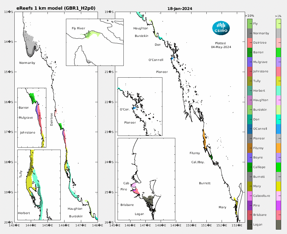
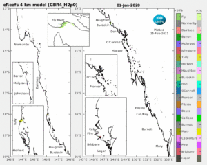
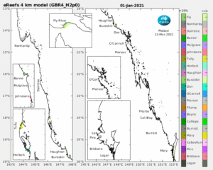
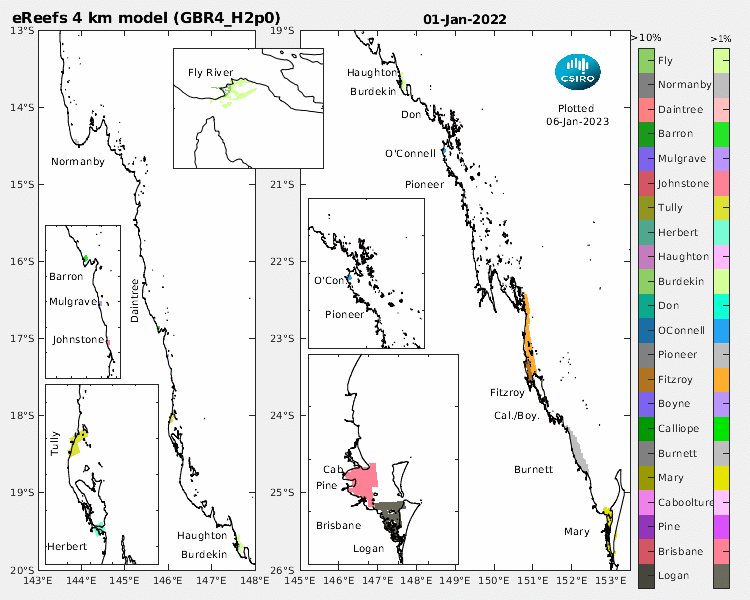
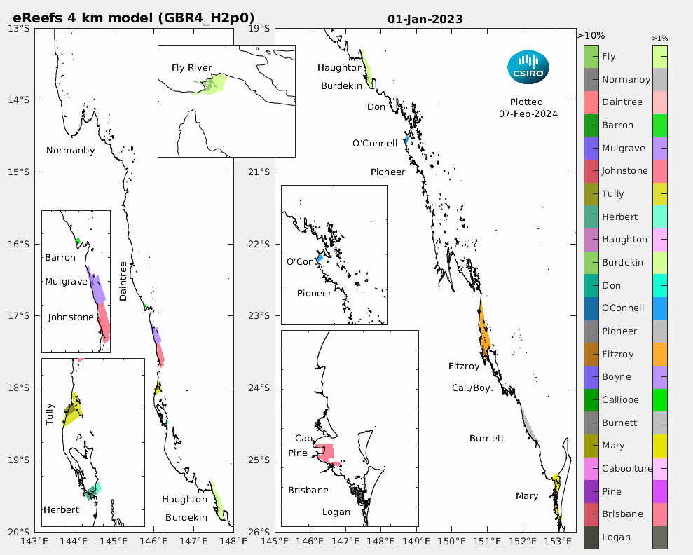
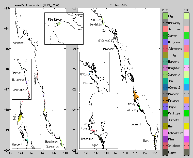
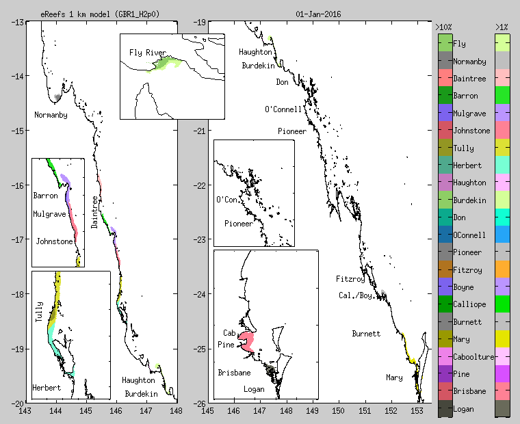
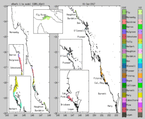
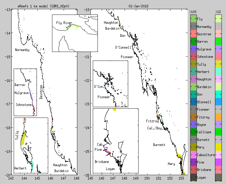
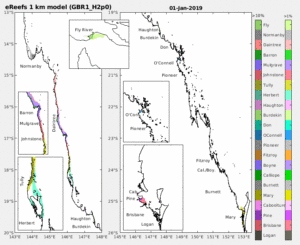
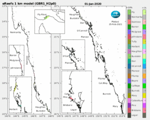
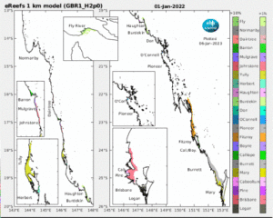
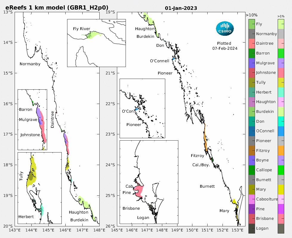
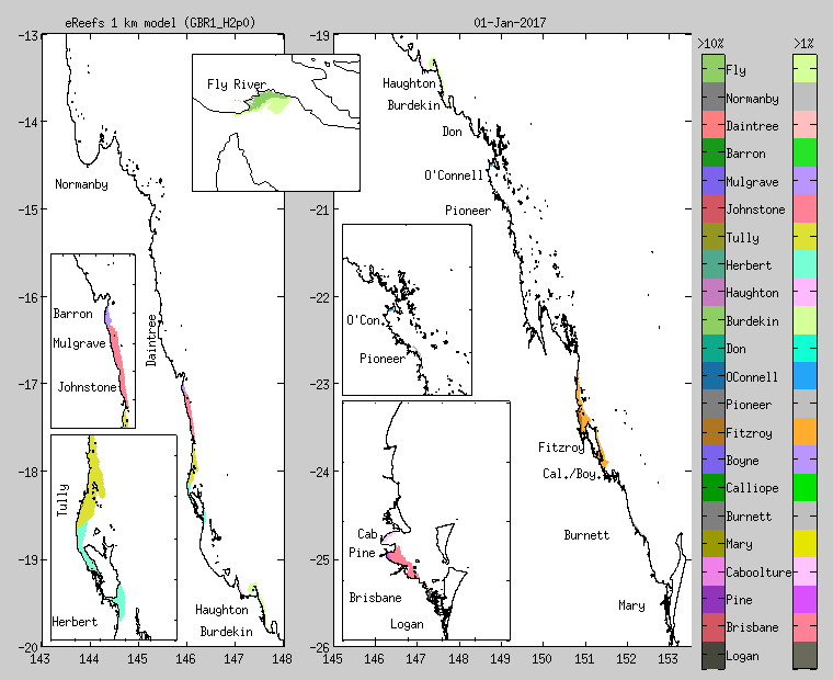
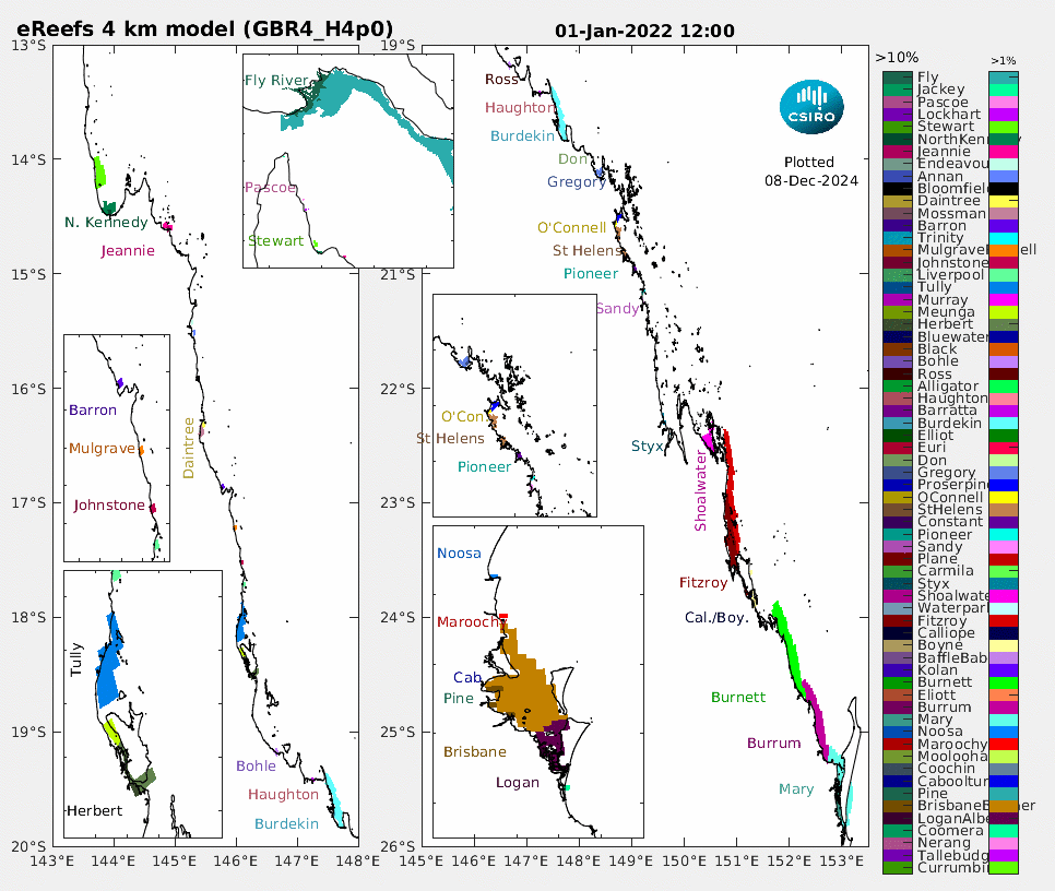
The time-varying footprint of the 21 QLD rivers (+ the Fly River) are mapped. For each river, two hues are given. The darker represents locations where greater than 10 % of the water is from a particular river, while the lighter hue represent between 10 and 1%. Where no river exceeds 1 %, the ocean appears white. If water at a particular location contains multiple river waters, only the higher concentration plume is shown. Here is the Matlab code (river_tracer_daily_plots_gbrfops) that produced these animations.
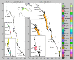
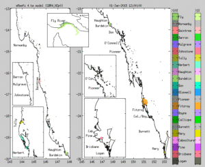
GBR4_H2p0 (thumbnails show 1 Jan – click to see year animation):

 2012
2012 2013
2013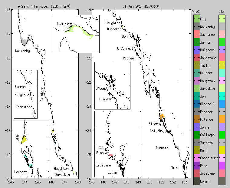
 2015
2015 2016
2016
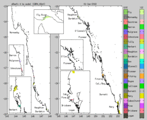 2018
2018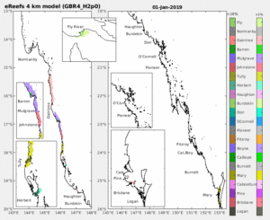
GBR1_H2p0 (thumbnails show 1 Jan – click to see year animation):

- In 2011, the Burdekin 1 % contour reaches Torres Strait, and the Fitzroy 1 % contour reaches Princess Charlotte Bay!
- In 2014 the dominant rivers are the Tully and Herbert, with no one river smothering the coast.
The midday concentration from 1 Jan 2011 – present of individual river tracers is now available through the NCI server as netcdf files, or visualised through the data explorer (search for individual river names).
https://research.csiro.au/ereefs/wp-content/uploads/sites/34/2024/12/GBR4_H4p0_65rivers_2022.gif
GBR1_H2p0 most recent (click for animation)