Data Visualisation
The eReefs data visualisation portal has been built to provide access to eReefs data products.
The portal is currently in Beta release, please contact us to let us know if you find any issues or have any suggestions.
Users can search for available data, load it to the map and find detailed information about the various data services associated with data products. The data visualisation portal feeds off the eReefs Data Brokering Layer, which includes many additional “semantic web” elements which improve the discovery of connected systems.
https://portal.ereefs.info
On this page:
- Basics
- Advanced tools
- Coming soon
Getting started:
To access the core data visualisation functionality, select Data Explorer from the home directory:
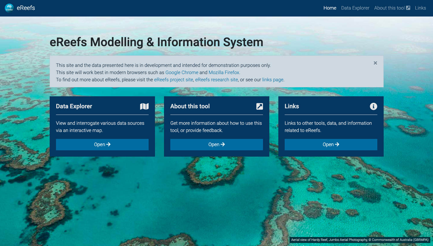
Home page of eReefs visualisation portal
To start using the data visualisation portal, click the ‘Browse data’ button to quickly access some commonly used data, or use the Node Explorer to browse eReefs datasets.
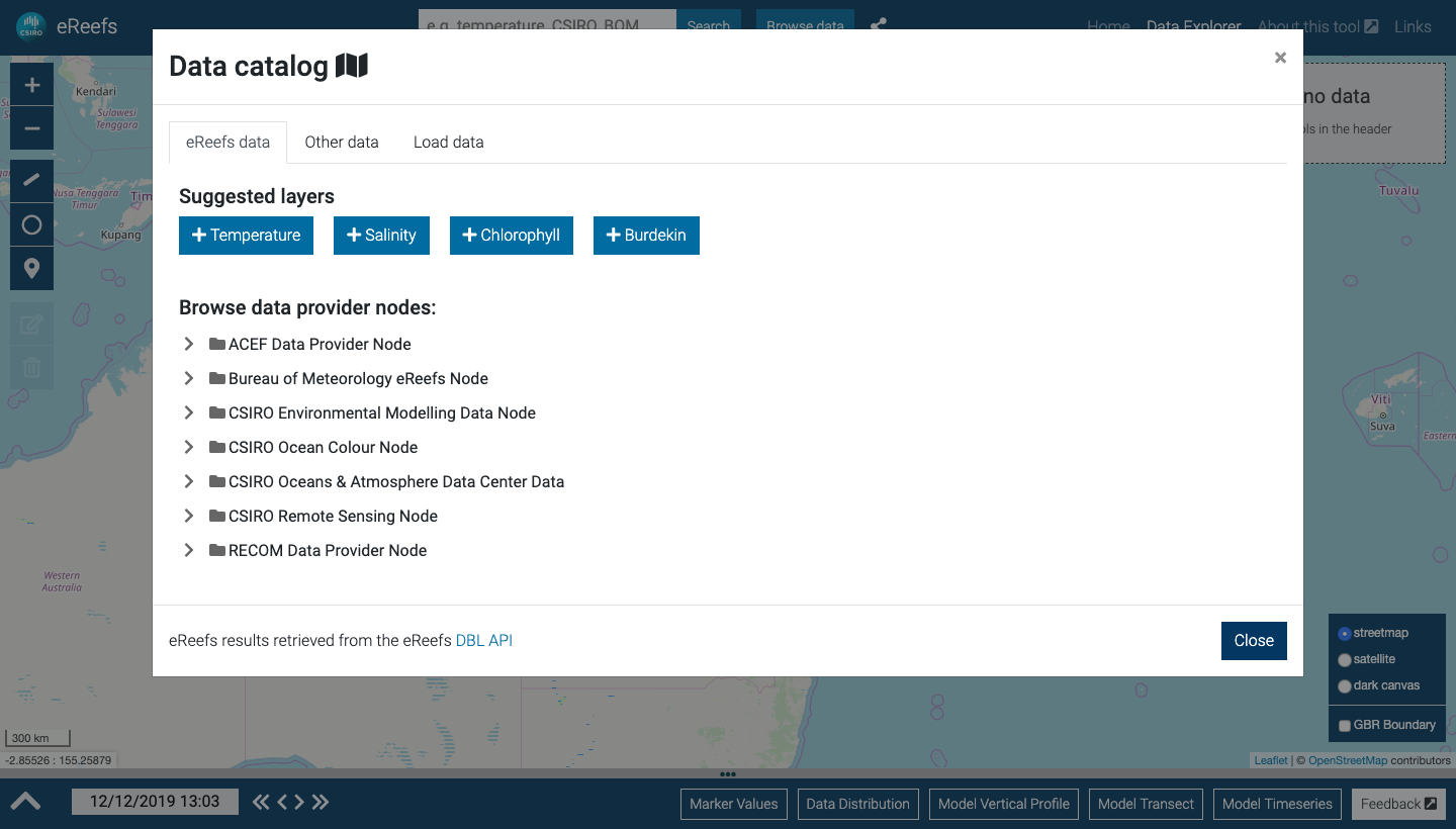
Quickly access suggested layers, or browse eReefs data provider nodes.
Alternatively, search for data using the search box. You can search for parameters such as ‘temperature’ or ‘salinity’ or you can search for data custodians such as ‘CSIRO’ or ‘BOM’. The search box will provide suggestions based on data that is available within the Data Brokering Layer.
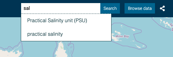
Start typing to search for available data.
Search results:
Once you have reached the search results screen, you can browse the data results.
The map and temporal chart show the geographic and temporal extents of the data. These can also be used to filter your search.
- To limit to a particular geographic area, draw a box using the ‘Draw a rectangle’ tool at the top right of the map.
- To limit by date, click and drag the area of interest – or pinch and zoom on touch devices.
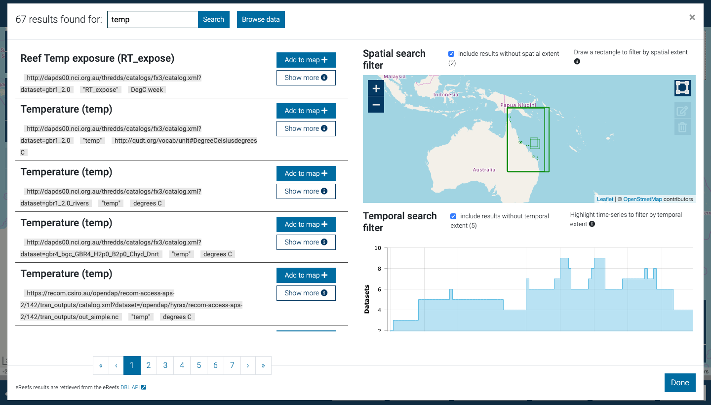
Search results with spatial and temporal filter controls
To get more detail on any dataset, click “Show more”. As shown below, this section provides you with more detailed information about where the data has come from, any additional descriptions about the data, the date range and the available web services. You can click each of these links to access the web service directly.
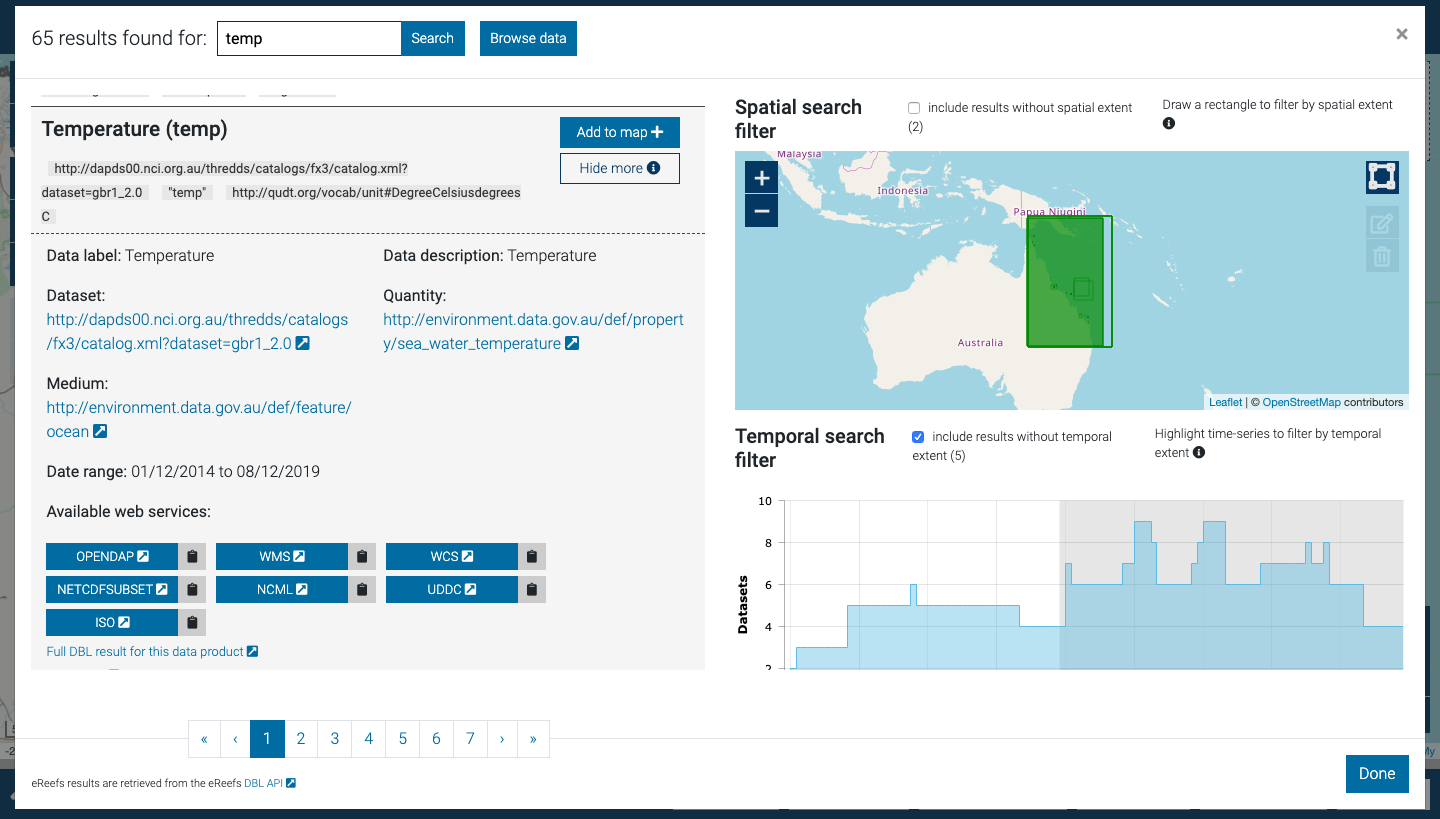
Search result expanded to show dataset metadata
Using the map:
Once you have loaded data to the map, the legend will be updated and the layer should load on the map. Some large datasets may take some time to load.
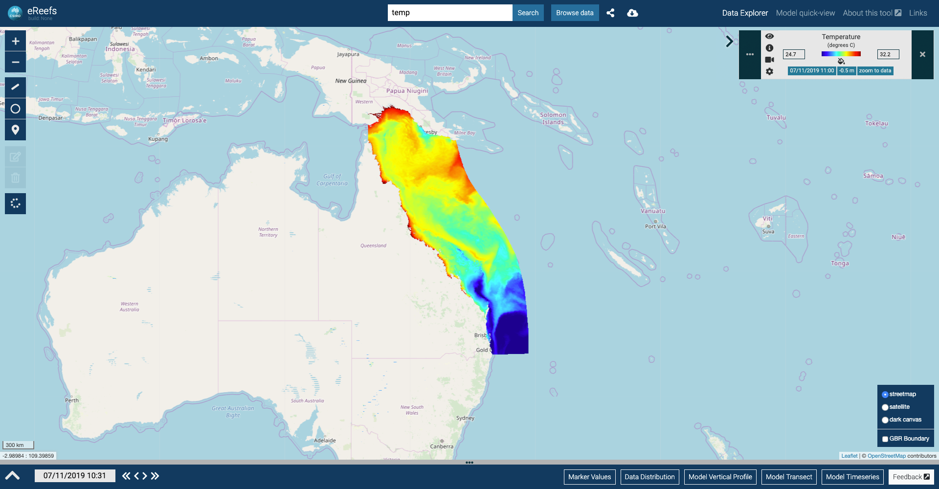
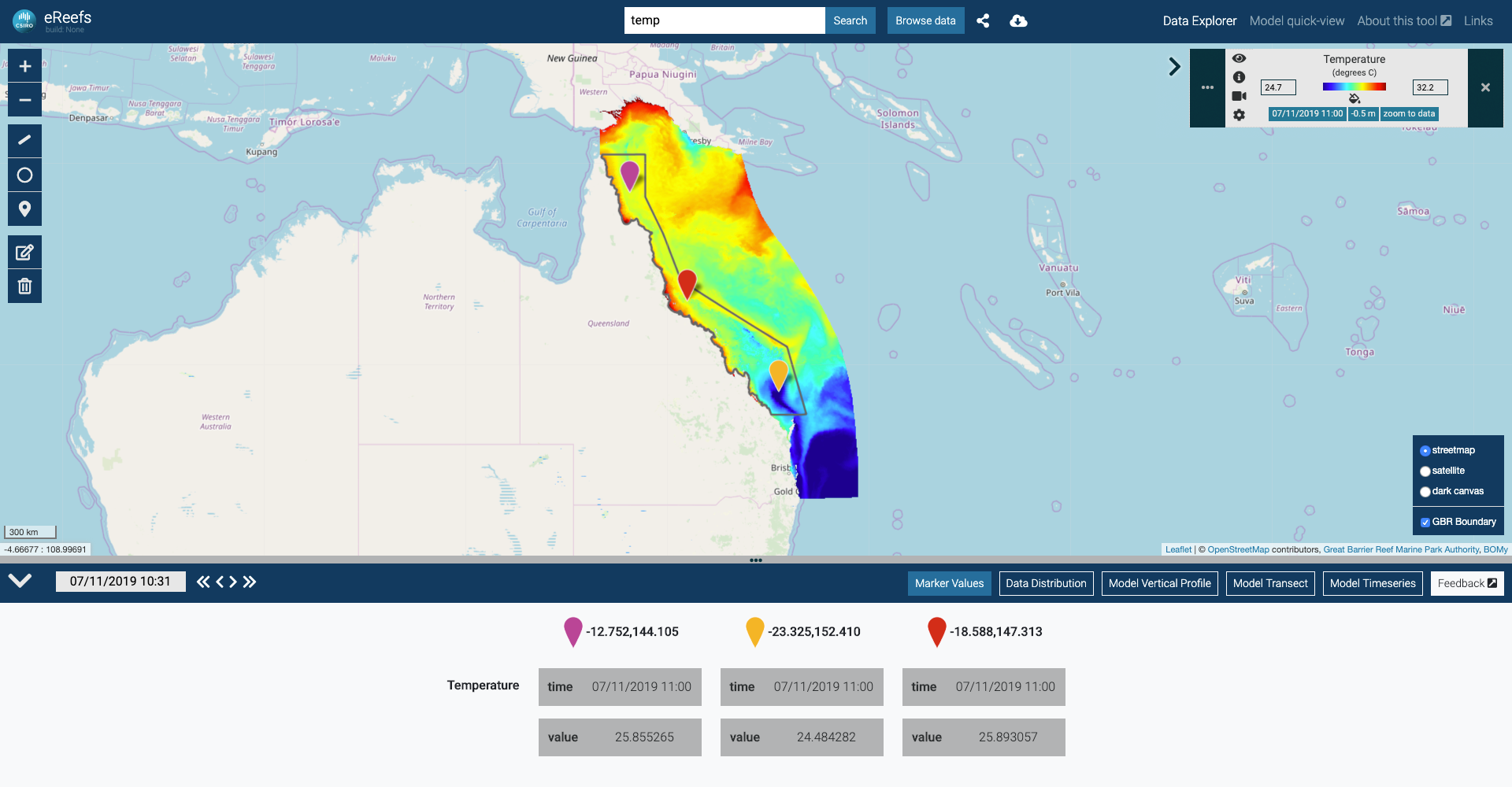
Map displaying GBR 4km temperature data.
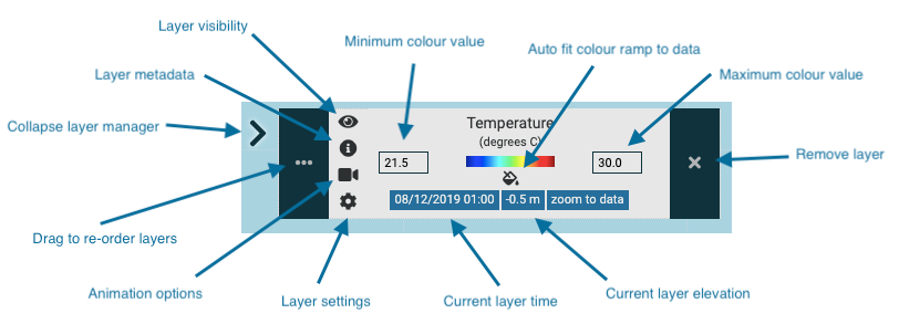
Layer Manager:
The Layer Manager in the top right contains a lot of information and tools to help you interact with the data. See below for help understanding the legend. You can adjust each layer’s opacity, elevation (if available), colour ramp, and other settings by clicking the ‘Layer settings’ tool.
It is important to note that the date, elevation and colour scale settings are unique to each dataset. When you change the Target Time, each layer will automatically show data for the nearest available date.
Layer Animations:
For data with a temporal dimension, we are able to combine time slices to create an animation for a given time period.
To create a layer animation:
- Press the video icon to open the Animation Configuration for a layer with temporal data.
- Select start and end dates.
- Press “Load animation frames” – note it may take a little time to build the animation.
Note that the animation will use a maximum of 24 time slices spread between start and end dates.
Draw Tools:
At the top left of the map, there are a series of ‘drawing tools’. See below for information on using these tools.
| Draw a transect | Draw a line on the map to graph visible data along the line. | |
| Draw a circle | Add a ring buffer layer to the map | |
| Draw a marker | Add marker to the map with data for each visible layer. | |
| Edit layers | Edit existing transects and markers. | |
| Delete layers | Delete existing transects and markers. |
Once you have added markers to the map, the values for each marker will be added to the “Marker Values” panel. This allows you to compare data at points through multiple layers.
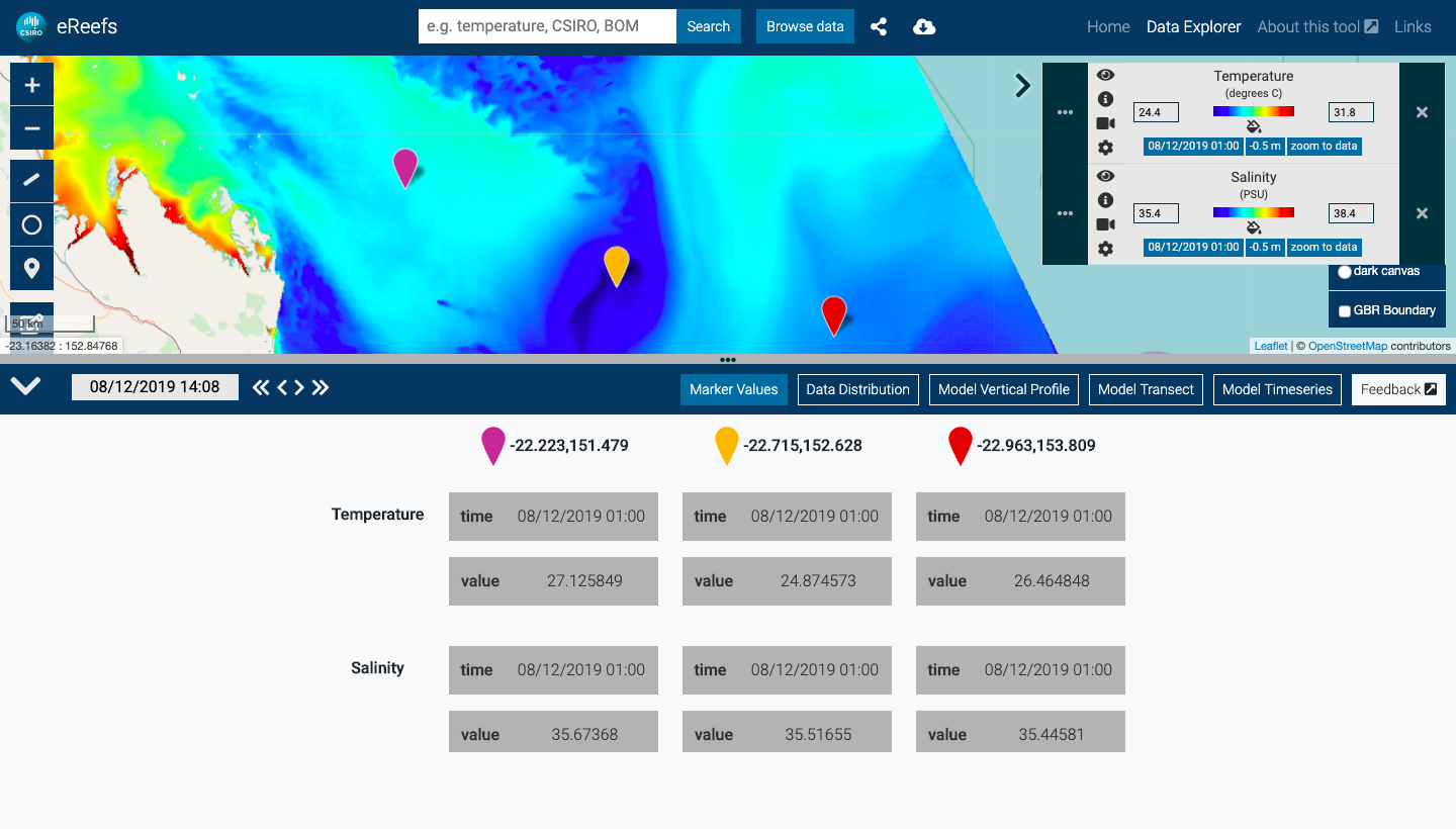
Time controls and data distribution chart:
The eReefs Visualisation Portal has a “master” time used by all visual components – called Target Time. Map layers, marker values, charts etc. all automatically use data closest to the current Target Time (actual time slice being used is shown in the Layer Manager).
To view data for a particular point in time, simply use the date/time picker or forward/back controls to update the Target Time in the footer.
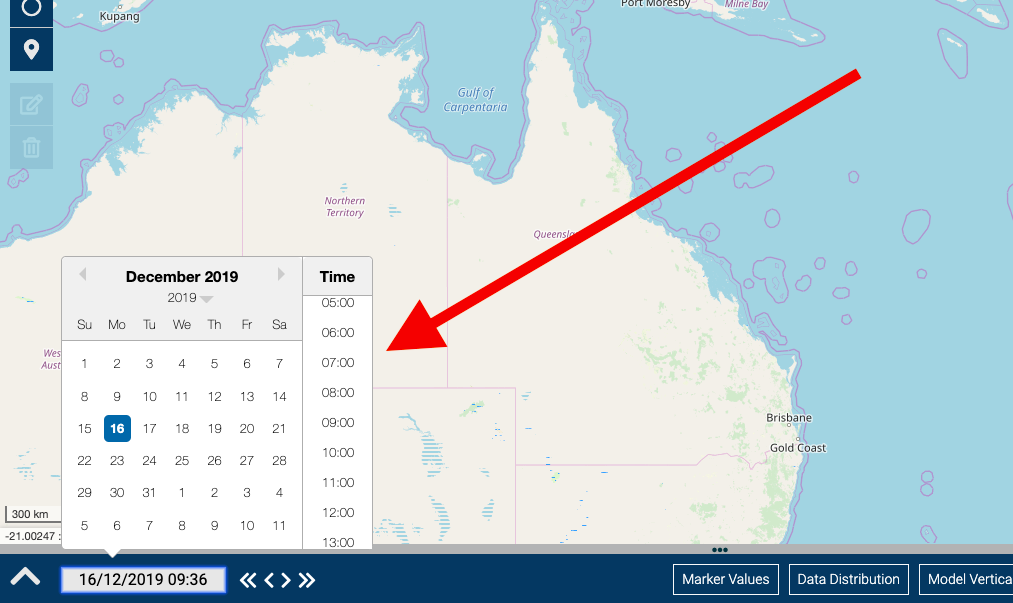
Selecting the target time using date-picker control
Additionally, all layers added to the map can have their temporal distribution visualised on a chart named “Data Distribution”. The Data Distribution chart provides a simple way to understand what data is available for each dataset, and makes it easy to quickly find a temporal intersects between datasets of interest (click point on chart to set Target Time).
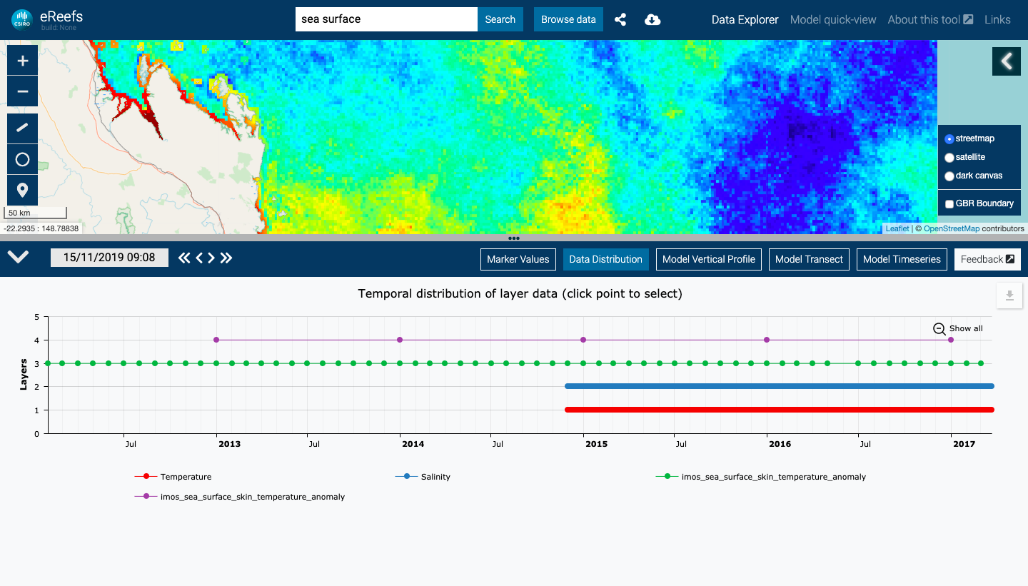
Use data distribution chart to explore data through time and set the Target Time
Model vertical profile:
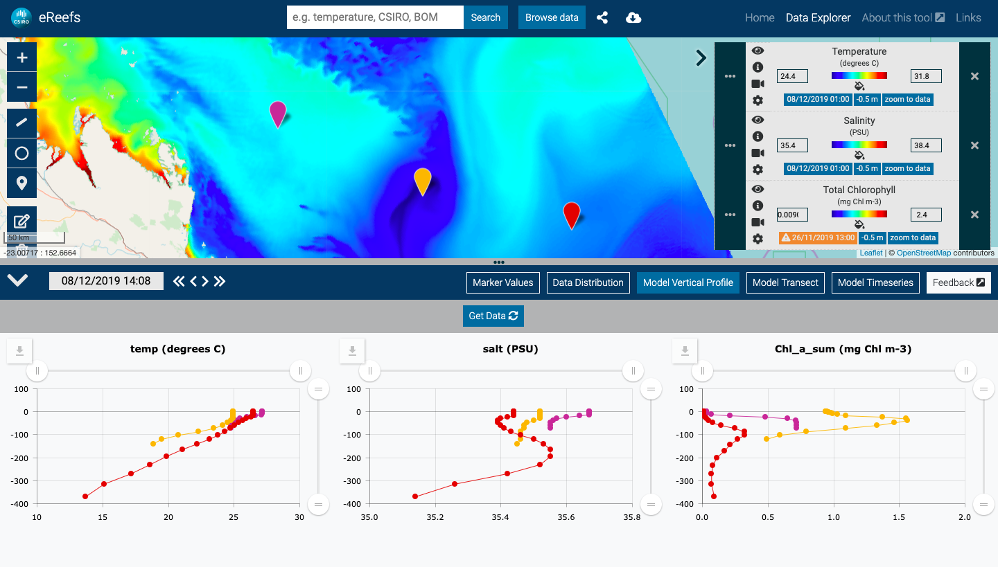
Vertical profile of GBR 1km temperature, salinity, and Chlorophyll
To create a vertical profile:
- Select a time of interest
- Add one or more layers to the map that have elevation dimension
- Add one or more markers to the map using draw tools
- Open the “Model Vertical Profile” panel in the footer, press “Get Data”
- Once built, you can also:
- export the data via the download icon at top right of each chart
Model time-series:
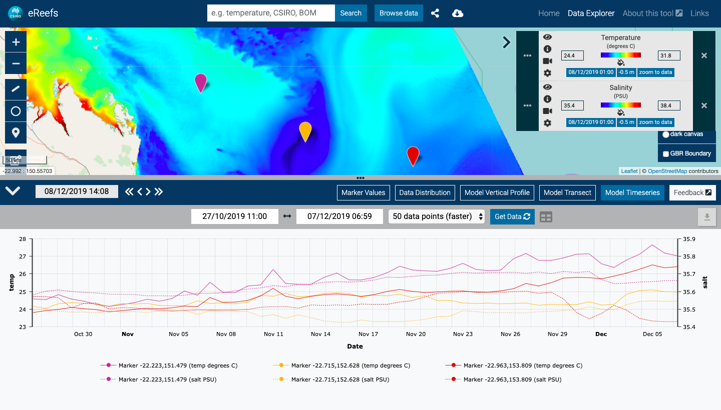
Time-series plot of GBR 1km temperature and salinity
To create a time-series:
- Add one or more layers to the map that have time dimension
- Add one or more markers to the map using draw tools
- Open the “Model Time-series” panel in the footer
- Select time range using date pickers
- Select number of data points to include in the time-series (more points means slower to get results)
- Note: time-series is created by spreading the number of data points approximately even across the requested time period
- Press “Get Data” to build
- Once built, you can also:
- view data in table by pressing the grey table icon
- export the data via the download icon at top right of chart
Model transect:
Transect of GBR 1km temperature and salinity
To create a transect:
- Select time of interest
- Add one or more layers to the map
- Add a transect path to the map using draw tools
- Open the “Model Transect” panel in the footer
- Once built, you can also:
- view data in table by pressing the grey table icon
- export the data via the download icon at top right of chart
Export data:
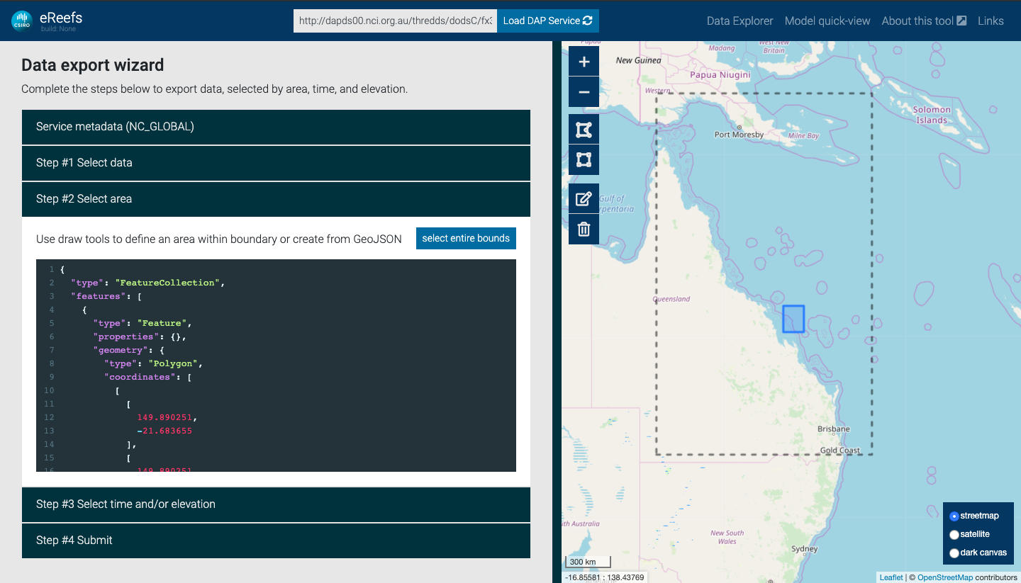
Exporting eReefs data via export wizard
Note: the export wizard is used to export subsets of raw model data (as a NetCDF file), however you may also export curated data as CSV/JSON via any of the charts described in previous sections.
To export raw data via the wizard:
- Load model data of interest to the map
- Press the download icon in the header (if you don’t see the download icon, the data on the map does not support export)
- Select the dataset to export from the popup modal and press “Start export”, this will take you to the Export Wizard
- Now complete the wizard steps to export data:
- select variables of interest
- select spatial area, either by:
- choosing “select entire bounds”
- using draw tools to draw rectangle or polygon
- adding or editing GeoJSON in the interactive editor
- select time and/or elevation
- submit
Coming soon:
We are continuing to work on additional functionality such as:
- observation data time-series
- additional charting options
- user accounts
- improved sharing support
- more animations
- improved colour ramps.
If there is a specific feature that you would like to see added, or to provide any other feedback – please reach out via the contact form.