Minardo – A novel strategy to visualise biological time-series data
Visual analysis of time-series data on protein phosphorylation presents a particular challenge: Bioinformatics tools currently available for visualising ‘omics’ data in time series have been developed primarily to study gene expression, and cannot easily be adopted to phosphorylation data, where a single protein typically has multiple phosphosites.
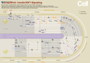
Minardo is a novel layout strategy — a reference to Charles Joseph Minard’s graph of Napoleon’s march — encoding the cell topology stretched out over time in a ‘circtangle’. Using this strategy, we produced a Cell SnapShot of the insulin signalling pathway encoding large-scale phosphoproteomics data with high dimensions. This layout facilitates exploration, identification of triggers and aids in understanding the cascade of biological events by displaying all time points in one graph.
In its current stage, Minardo is a layout strategy to visualise large-scale cell signalling data with time profiles applied to the time-series data on insulin response. This strategy is adaptable and can be applied to a multitude of cell signalling data. In future work, we plan to turn Minardo into a web-based application tool, allowing interactive visualisation and easy collaboration.
Publications:
- D. K. G. Ma, C. Stolte, S. Kaur, M. Bain, and S. I. O’Donoghue, “Visual analytics of phosphorylation time-series data on insulin response,” AIP Conference Proceedings, vol. 1559, no. 2013, pp. 185–196, 2013.
- D. K. Ma, C. Stolte, J. R. Krycer, D. E. James, and S. I. O’Donoghue, “Snapshot: Insulin/IGF1 signaling,” Cell, vol. 161, no. 4, pp. 948–948, 2015.